TORRECID is a company with a unique personality within the sectors in which it is present. Our visual communication should help transmit the Leadership, Excellence and Compromise expected. The TORRECID brand has transmitted a series of consolidated values over the years. A well-applied brand is the most solid base on which adhesion, fast identification and connection with a project is generated.
Download the file that you need
CORPORATE COLOUR
The corporate colour is green, with tonalities ranging from green forest to emerald green. In regards to the meaning, green is the most relaxing colour for the human eye. It is associated with harmony, stability, balance, safety, elegance, growth, exuberance, fertility, sophistication, refinement, rest and freshness. In the logo, this green is combined with black typography and the profile of the tower, providing contrast and legibility.

CODE COLOURS:
Pantone
334 C
CMYK
C: 100 M: 2 Y: 64 K: 0
RGB
R: 0 G: 148 B: 122
Web
#009579
RAL
6016
TCX (Textil)
17-5638 TCX

CODE COLOURS:
Pantone
Black 6 C
CMYK
C: 84 M: 83 Y: 73 K: 80
RGB
R: 0 G: 0 B: 0
Web
#00000
RAL
9005
TCX (Textil)
19-3911 TCX
COLOUR VARIATIONS
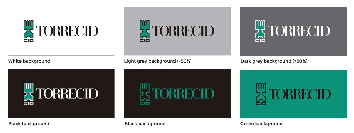
In any case, the chromatic range shown in this section must be adhered to, with the exception of advertising projects, where the last approval will always be given from Torrecid.


